If you’ve been following Apple’s recent product releases, you’ve probably heard the term “Liquid Glass.” That’s what Apple calls its newest design language, a combination of an aesthetic look and functional philosophy for the user interface in iOS 26, iPadOS 26, and macOS 26 Tahoe, in particular, but also in watchOS 26, visionOS 26, and tvOS 26 (we think of them collectively as OS 26). Apple describes Liquid Glass as a “translucent material that reflects and refracts its surroundings, while dynamically transforming to help bring greater focus to content.” The company claims that Liquid Glass “makes apps and system experiences more expressive and delightful while being instantly familiar.” Apple even has an intro video.
Beyond the marketing speak, that means most of the controls you’ll interact with in Apple’s new operating system will be semi-transparent and appear to float above the content, blurring what’s underneath and adjusting to the underlying content’s color. That may make it easier for you to focus on your content, or it may make the interface harder to read. Liquid Glass also features subtle animations that may seem fun or make everything feel a little squishy.
Like many of Apple’s interface changes over the years, Liquid Glass has sparked strong reactions—some love it, while others dislike it. While we’ll explore the pros and cons below, it’s worth acknowledging upfront that Liquid Glass represents Apple’s vision for the future of its interfaces. Although you can adjust various settings to make it more comfortable to use (which we’ll cover shortly), Liquid Glass will be part of all Apple operating systems going forward. The good news is that, as with previous major interface changes, such as Aqua in Mac OS X and iOS 7, we’ll all adapt to it over time as Apple continues to refine and enhance the experience.
Liquid Glass Pros
Although Liquid Glass might appear to be just a fashionable cosmetic update, Apple’s designers had some serious objectives:
- Cross-device platform consistency: Many Apple users own an iPhone, iPad, Mac, Apple Watch, and Apple TV. The interfaces for these operating systems have all evolved somewhat independently due to differences in their development, usage, and screen sizes. Liquid Glass is Apple’s effort to unify the design language across its devices, making each device feel like part of a cohesive design philosophy.
- Focus on content: Between the translucent look that refracts the content behind it and by having interface elements morph and fade when not in use, Apple designed Liquid Glass to help you focus on your content rather than cluttering the screen with controls.
- Modern look and feel: While longtime Apple users may prioritize functionality and familiarity, one of Apple’s main goals is to attract new users by convincing them to switch from Android and Windows or encouraging them to start with Apple devices. Liquid Glass draws inspiration from futuristic devices seen in science fiction shows and movies, which might especially appeal to younger users who have grown up with these visual references.
- Fluid animations: By adding subtle animations to Liquid Glass, Apple makes the interface come alive in a way that wouldn’t be possible otherwise. Again, that may attract new users or impress possible switchers.
- Personalization: Some people have a strong aesthetic desire to see their interfaces be clear or tinted rather than have every icon in its own bold color. With Liquid Glass, you can customize your icons, widgets, and folders to work better in dark mode, be clear, or have any tint you prefer.
- Technical showcase: Liquid Glass’s complex real-time blurring and lighting effects require a significant amount of processing power, but Apple’s A-series and M-series chips are up to the task. This is another case of competitive advantage—Apple is showing off by saying, “Our devices have so much power that we can use it to make the interface snazzy looking.”
Liquid Glass Cons
Just because Apple describes Liquid Glass as “delightful” doesn’t mean everyone will agree. Many users dislike change, and numerous user experience experts have criticized aspects of Liquid Glass. Some of the concerns include:
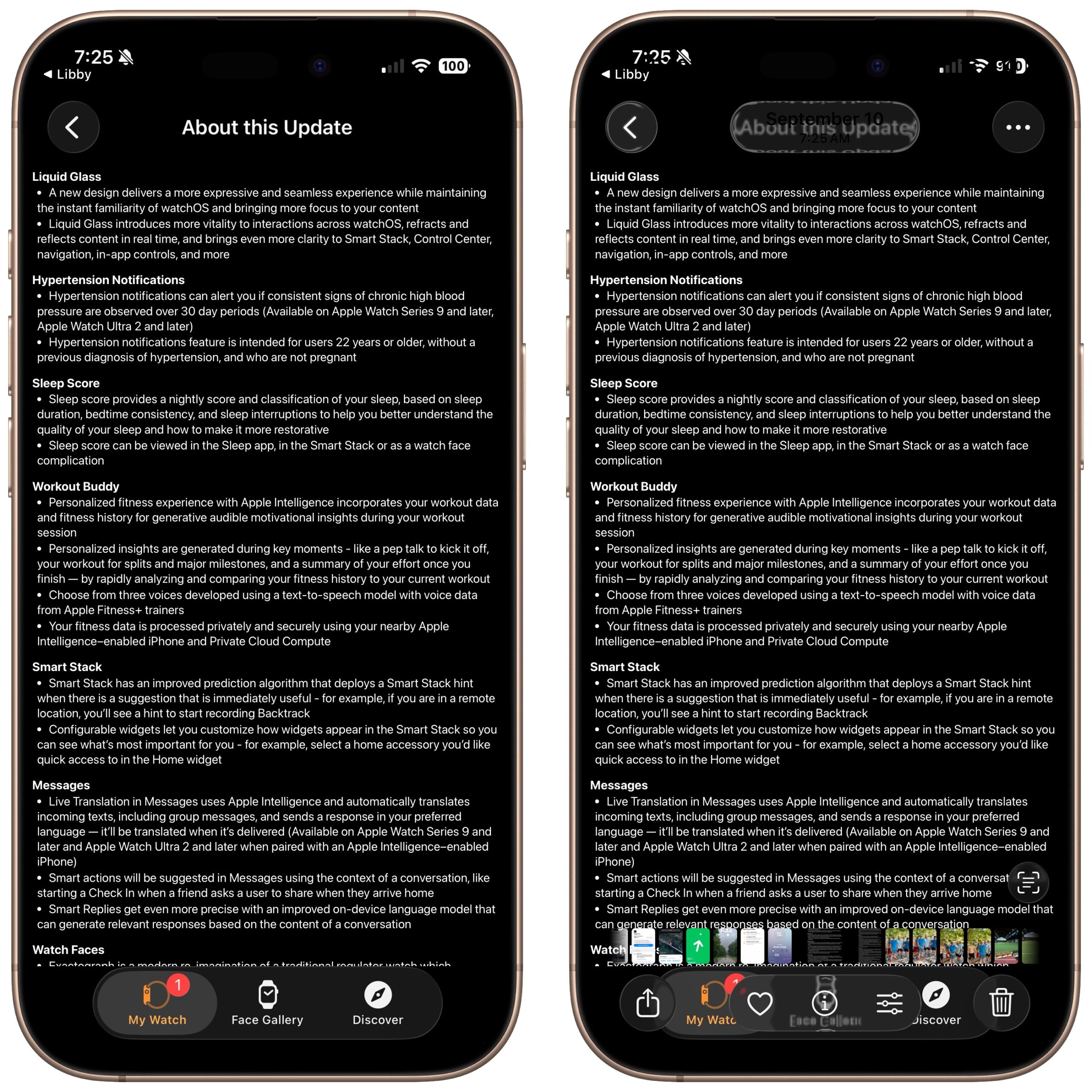
- Readability: When Liquid Glass displays light gray text on a clear control positioned over a dark background with additional text, it becomes almost unreadable. While this is an extreme case, many floating translucent controls over backgrounds can cause legibility issues, especially for those whose vision isn’t perfect. As you can see in this screenshot of iOS 26’s release notes (below, left), the Liquid Glass controls in Photos are notably awkward (below, right).
- Learning curve: Apple can say that the interface changes in Liquid Glass are for the better, but there’s no denying that everyone will need to learn something new. That’s easier for some users than others, and many people will be boggled by controls moving around.
- Matter of taste: Not everyone shares Apple’s design aesthetics. Some people find Liquid Glass to be cartoonish or distracting.
- Inconsistent design: While Liquid Glass aims to create a uniform design language across all Apple platforms, it will take time for even Apple to update everything. Some third-party apps will never receive updates, and some developers may refuse to modify their interfaces to support Liquid Glass. We’ll be dealing with inconsistent interfaces for several years.
- Performance issues: On some older devices, Liquid Glass may feel sluggish or drain the battery more quickly due to heavy GPU usage. Although Apple doesn’t intend to create a bad user experience for anyone, performance issues may nudge some people to upgrade sooner than they planned.
Liquid Glass to Solid Metal
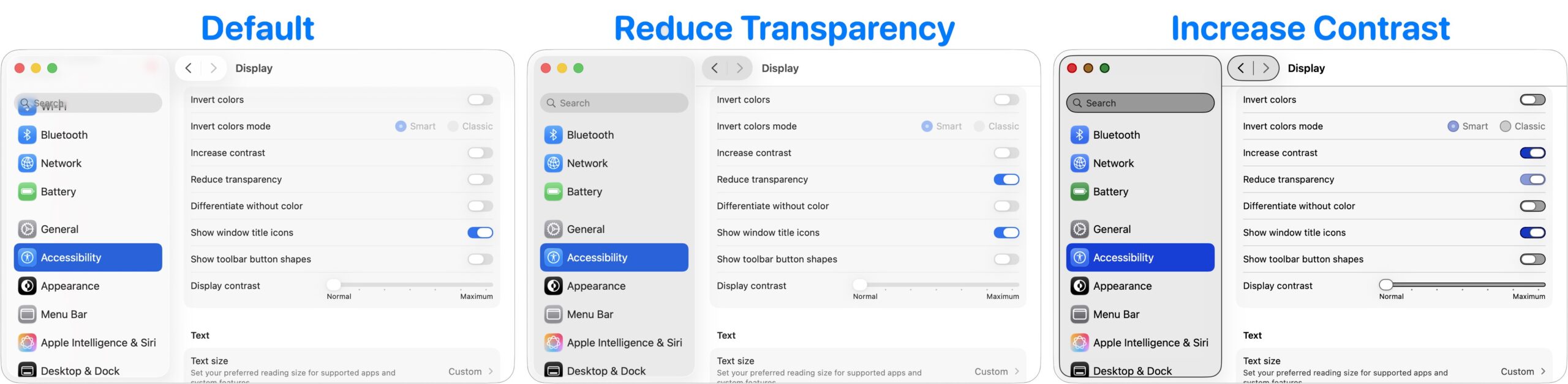
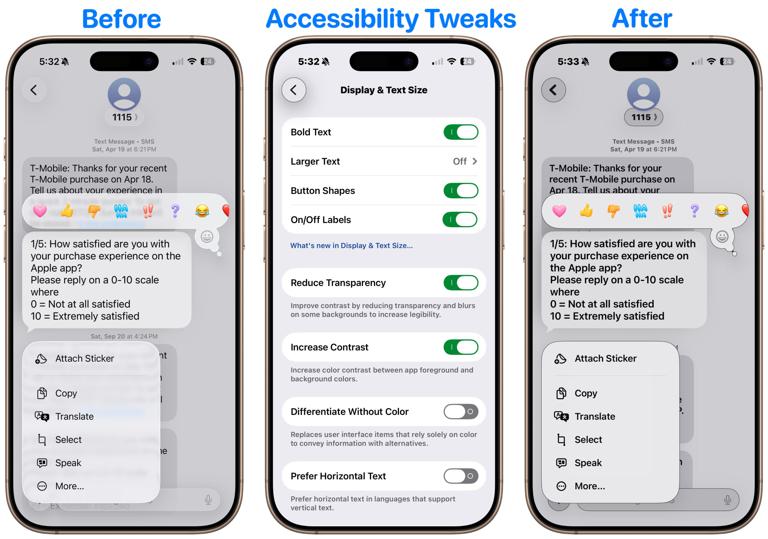
You can’t turn off Liquid Glass, but three Accessibility settings will make it less liquid and less glassy on the iPhone, iPad, and Mac. There are also a few additional settings that may make the iPhone and iPad easier to use. All these settings are independent, so you can mix and match to find the combination that gives you the look you prefer. (Paths are for the iPhone and iPad; on the Mac, start with System Settings and note slight naming differences.)
- Reduce Transparency: Turning on Settings > Accessibility > Display & Text Size > Reduce Transparency significantly improves Liquid Glass readability by making translucent panels opaque, adding solid backgrounds, and reducing blur. On the Mac, this setting restores the solid menu bar. However, Reduce Transparency may make certain aspects of the interface look awkward, such as when a previously transparent toolbar suddenly covers a much larger part of the screen.
- Increase Contrast: Enabling Settings > Accessibility > Display & Text Size > Increase Contrast makes interface elements stand out more by sharpening borders and reducing the tendency for controls to meld with the background. Keep in mind that Increase Contrast can also significantly alter the colors of many interface elements.
- Reduce Motion: If Liquid Glass’s animations, blurring, and parallax effects make you a little queasy, turn on Settings > Accessibility > Motion > Reduce Motion. While you’re here, turn on Prefer Cross-Fade Transitions to minimize motion for interface controls that slide in and out. A warning—without transitions, some parts of the iPhone and iPad experience might seem abrupt.
The next three settings are exclusive to the iPhone and iPad, and you’ll find them in Settings > Accessibility > Display & Text Size:
- Bold Text: Flipping this switch makes all interface text bold, which can make it much easier to read, particularly when transparency renders thin glyphs nearly invisible.
- Button Shapes: It’s harder to find controls that benefit from turning Button Shapes on, but if you want a true button instead of blue text or underlines that show a label is clickable, turn this on.
- On/Off Labels: Turning this setting on displays small | and O labels for On and Off on all switches to help clarify if the change from gray (Off) to colored (On) isn’t clear.
Again, Liquid Glass is the foreseeable future of Apple interface design, and while it’s far from perfect right now, we anticipate Apple improving and refining it over the next few releases. You can help nudge that process in the direction you want by submitting feedback to Apple.
(Featured image by Apple)